 |
1.
The Story So Far...
In steps 1 & 2 of my serialized tutorial I corrected the brightness and contrast on my dark image via the Levels and Curves Commands.
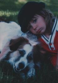
Next, in Step 3, I used the Image: Adjust: Color Balance... command to make a dramatic change in the image's colors. What I've done so far results in the image to the lower left. It looks pretty good and we're almost done. As in Step 2, I'm going to make some subtle adjustments to what I began in the previous step. Here I'll use the Image: Adjust: Hue/Saturation... command to make some final color changes. |
 |
2.
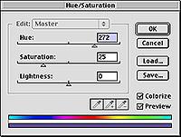
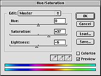
Image: Adjust: Hue/Saturation... does what it's name implies and lets you make adjustments to the color (hue) and saturation of your image. The dialog box is equipped with three sliders you make adjustments to. As for Hue:, moving this slider takes you through the entire color spectrum. Anyone remember the acronym, ROYGBIV, from when they learned the colors of the rainbow? That's the order the colors are in. Down at the bottom you can see two narrow horizontal rectangles that show how the colors are laid out in the spectrum. The upper rectangle remains constant, for reference, presumably; and the bottom spectrum will move and change depending on whatever Hue, Saturation and Lightness setting you choose.
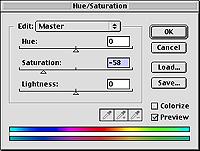
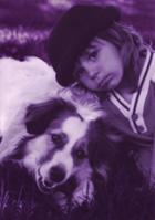
Saturation is color intensity- sort of a level of purity in the hue. Lower saturated colors are less intense- they seem more grayish. The higher the saturation level, the brighter and more vibrant a color will be. To the left here, you can see I've lowered the Saturation level of my image (negative 58) and the results are interesting. There's just a little more than a hint of color and it give the image an old or faded quality.
Lightness: of course just effects the brightness level of whatever image you're editing. |
|
|
 |
3.
Now let's get to know the Hue/Saturation Dialog Box a bit more. We might as well have some fun before we get to work on the image.
Notice I've checked the Colorize box in the image to the left. This converts the image to a monochromatic version of whatever your current foreground color is. Or, you can move the Hue slider to pick another. You can make Saturation and lightness adjustments if you wish. Notice how the bottom spectrum changes to one color. This can come in very handy if you want to change the color completely in a selected area. Scan a picture of yourself, select the hair and choose Colorize to find out just how good you'll look before you spend all that money getting your hair dyed pink. Scan a photo of your house or a room and colorize the walls to find out what color combinations would look best before you paint. I used colorize frequently to make a bunch of variations of web page background tiles or web buttons. You can have lots of fun with the colorize option. |
 |
4.
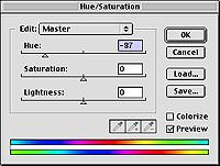
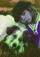
With the Colorize Box unchecked, moving the Hue slider will alter all the colors in your image (or a selection) at the same time; and to the same degree, relative to what the original hues were.
In the images to the left, you can see that taking the hue slider down 87 degrees changes my reds and greens to violets and yellow/oranges. |
 |
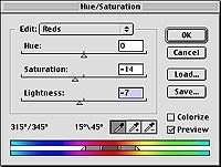
5.
Here's a less frightening variation on what I did in step 4 above. With a lot of Photoshop's adjustment tools, it's interesting to take things to the extreme and see what's possible. This can be useful if you desire some surreal qualities in your work, but of course if your goal is realism, Your slider adjustments will probably be a lot closer to the center.
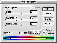
Notice the Edit: pop up menu at the top. Another dimension to the Hue/Saturation Dialog Box is added when you choose one of the preset color ranges from the pop-up list. There's Reds, Yellows, Greens, Cyans, Blues, and Magentas. Up until now, I've just had Master chosen, which affects everything. If you choose one of the pop up colors, Hue/Saturation will only affect the areas of you image that fall within that range. You can add colors and expand or limit the range using the eyedropper tools. |
 |
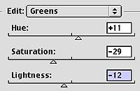
6.
Time to get down to serious work, darn it. To begin I choose New Adjustment Layer from the Layers Palette's Command Menu (located in the upper right if you click on the arrow). I actually did this several times, so I'll have more than one Hue/ Saturation adjustment layer when I'm done. You just have to look at you image, decide what it needs, make adjustments to the sliders and evaluate the results. Then make more adjustments. I started by cranking the saturation up a bit in the Master channel (not pictured) to make all colors in the image just a little more vibrant. You can see to the left how I then brought the cyan and red saturation down slightly. |
 |
7.
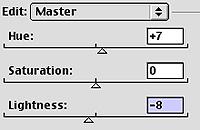
I continue on my way altering colors. Now rather than having the entire image affected, I made a selection of the grass in the top of the image. I've got two grass sections in my image. At the top- lots of greens and yellows. At the bottom- blues and darks mostly. I'm going to try to get them a little closer in color.
In the top image to the left I changed the hue and saturation while in the green color range. In the Master range, I moved the Hue slider over to the right. In both cases, this made the greens more blue. Remember I only had the top grass selected here. |
 |
8.
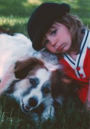
Time for an interlude. I'm not done with that grass yet.
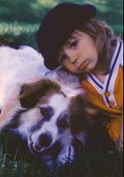
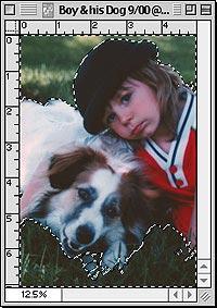
Here's What the image looks like so far. It's definitely more colorful now. But is it too much? If you stare at an image too long, you lose your objectivity. It also depends what your output is; your ultimate destination for the image. If you're going to use an image on the web, you can rely on what it looks like on your screen (assuming it's calibrated well). Remember, my image is actually 5" x 7" and 300ppi.
The ppi- pixels per inch is what you say when the image is on screen. The monitor displays pixels after all. If you print it, the resolution becomes dpi, or dots per inch.
I eventually want to print this on high quality photo paper, so it's OK I think to have the image's saturation just a bit over the top.
Do you remember the first time you were all excited to print something that looked great on screen, and when it finally came out of the printer you stood there with a bemused expression on your face, thinking, "What the ****?" Part of that has to do with the conversion of an RGB image to 4-color ink printing (CMYK), but it goes deeper than that. The very nature of the way you see color on a screen and the way you see it on paper is a completely different process.
It really depends on what printer you have (some up the saturation level themselves and make the CMYK conversion better than others). Notice that after I evaluated the results of my work I thought it needed a little toning down, so I changed that layer's transparency level (Opacity: 84%). After a test printing, I may push that level back up if I think the print needs stronger colors. |
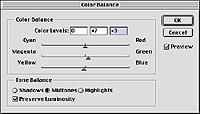 |
9.
Back to business. I painted a mask for the grass at the bottom of my image (that was a time consuming nightmare) and before I get back to hue saturation, I made this adjustment to the color balance, I wanted a little more yellow and green so it's hues are closer to the top of my picture. |
 |
10.
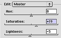
With the top and bottom matching as close as I thought I could get away with, I load both my saved selections (by holding down the Shift key as I load the second), and it's time to enhance the color of both.
That's such a vibrant red in the boy's shirt, I want to raise the saturation level of the grass a little to match. I decided +19 was the best amount and after evaluation, decided to take the lightness down slightly. |
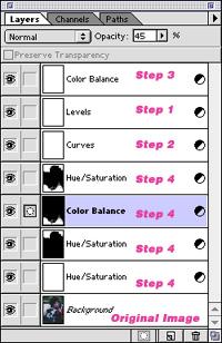 |
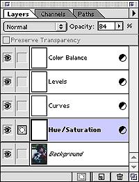
11.
Here's what the Layers palette looks like thus far. I've labeled the layers according to which step of the tutorial they were created in. Though I'm trying to keep this simple, you can see I made four new adjustment layers in this tutorial alone.
(Notice the color balance layer I made in #9 above is set to 45% opacity) |
 |
12.
Well it's been a complex journey, but it's time for the final evaluation of the small JPEG versions of my 300ppi file. Though we did a lot of work this time the changes are subtle. Pay particular attention to the grass areas. The updated image is the one on the bottom. |